The logo
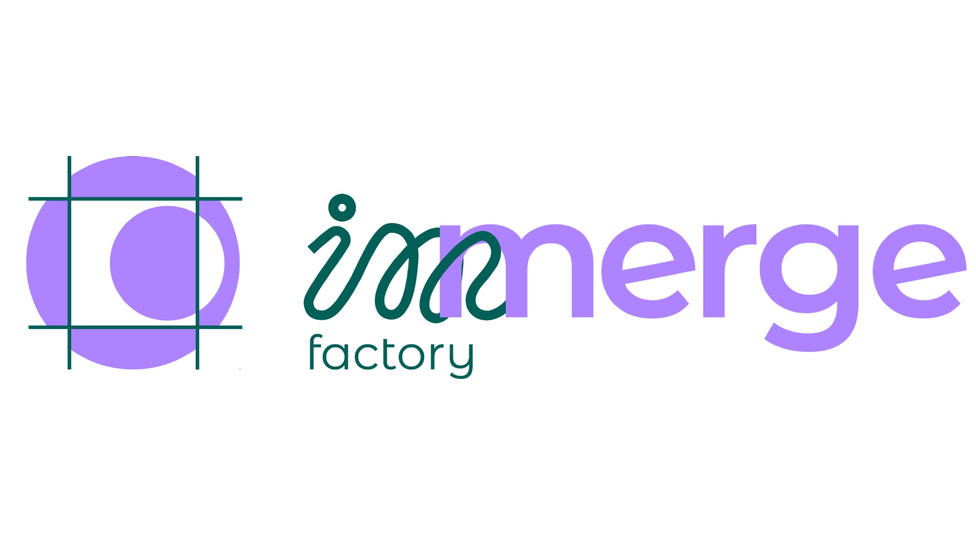
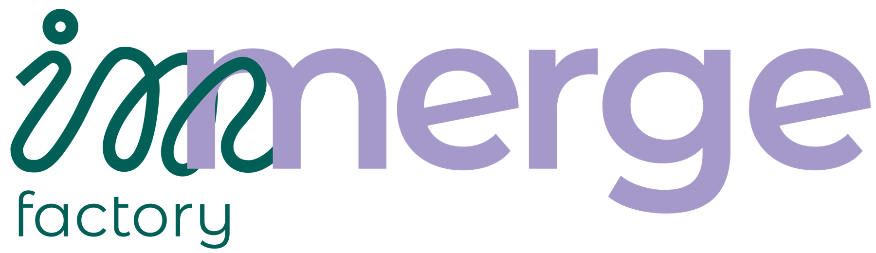
“Im” in green and “merge” in lilac, joined by a soft, fluid stroke: the merging shows in the lettering too.
Project · Naming · Logo & identity
How is a new brand born without breaking away from its parent?
01 · The challenge
Impulso, a communication agency in Trentino, was opening a new division dedicated to organizing events. It needed an identity distinct from the main brand, but with a clear visual and conceptual link.
It was my thesis project, developed inside the agency together with two girls from the team.


02 · The name
In English
03 · The logo
04 · The identity
“Im” in green and “merge” in lilac, joined by a soft, fluid stroke: the merging shows in the lettering too.
Green recalls Trentino and physical space. Lilac represents people and relationships. A warm white and a cool black keep everything in balance.
Poiret One has sharp corners but a round “o”: the same dialogue between circle and square as the logo. Montserrat Alternates for the word “factory”.
Poiret One
ABCDEFGHIJKLM nopqrstuvwxyzMontserrat Alternates
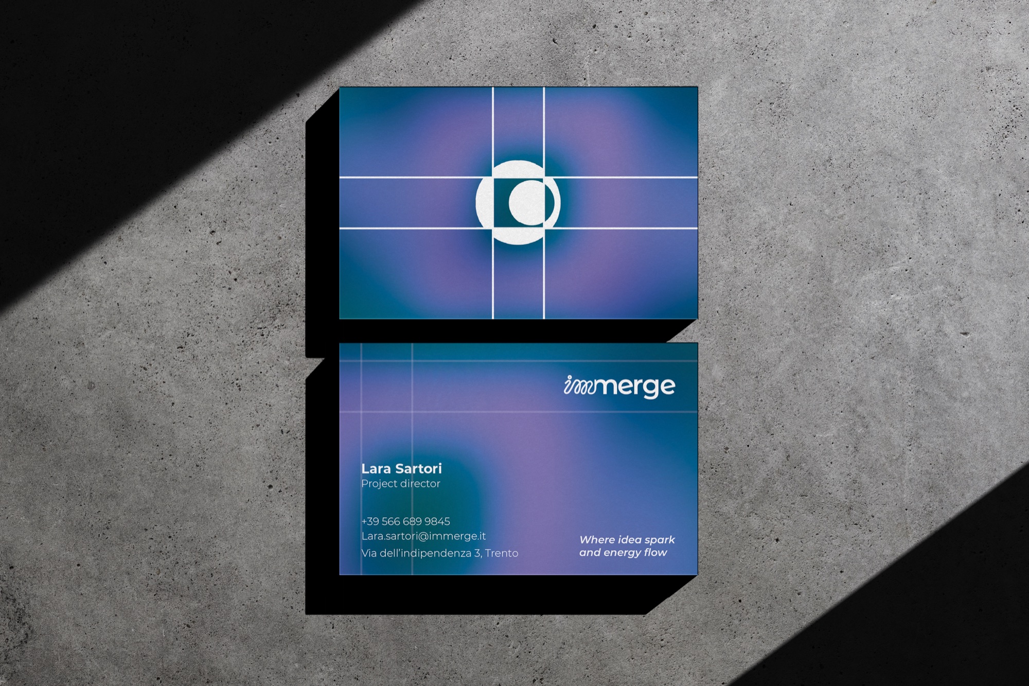
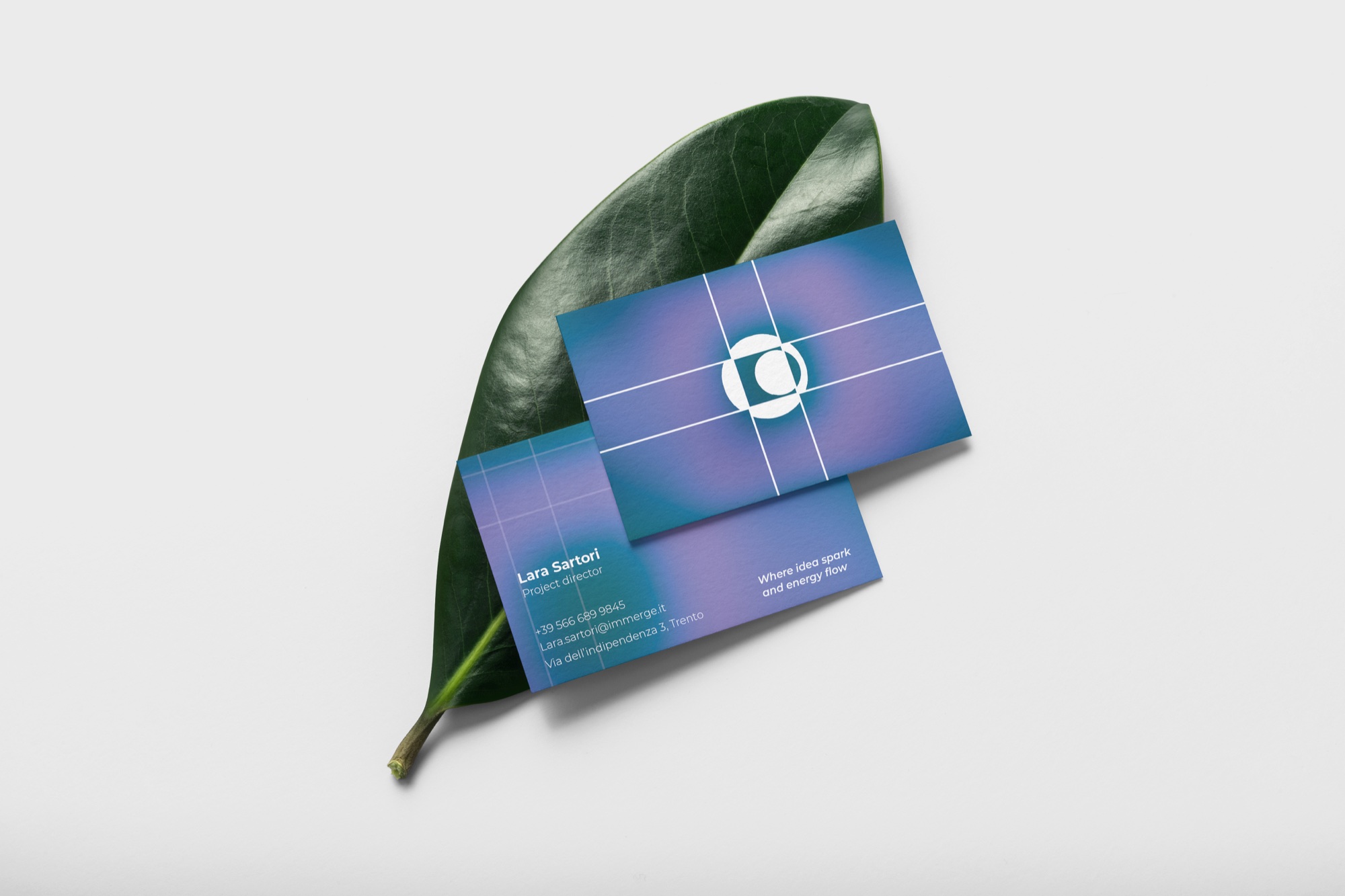
ABCDEFGHIJKLM nopqrstuvwxyzThe gradient between green and lilac becomes the brand's surface: circle and square are recognizable even at small sizes.
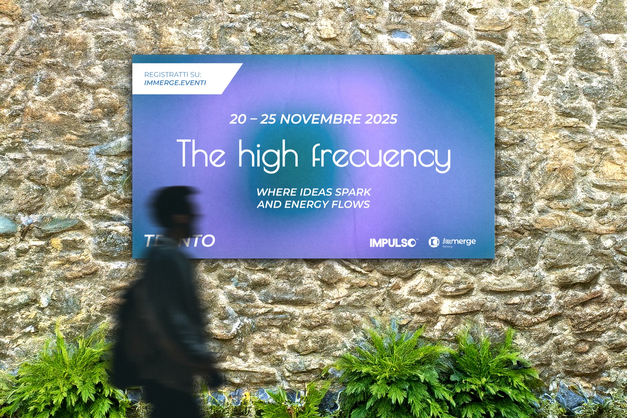
Posters, banners and roll-ups for a sample event, The High Frequency: the brand hits the streets.
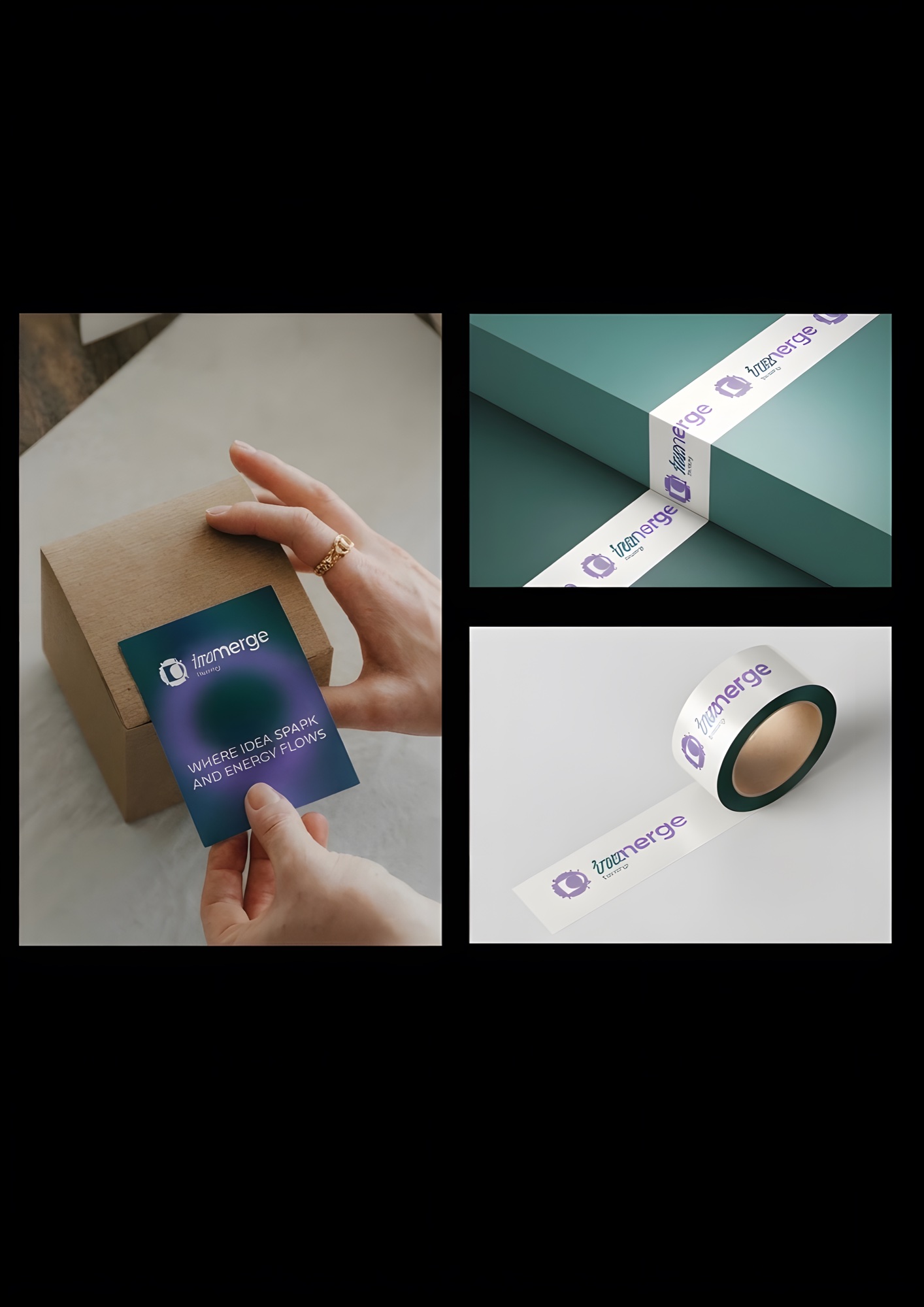
Stickers for boxes and decorative ribbons to customize packages: a simple idea for original offline communication.
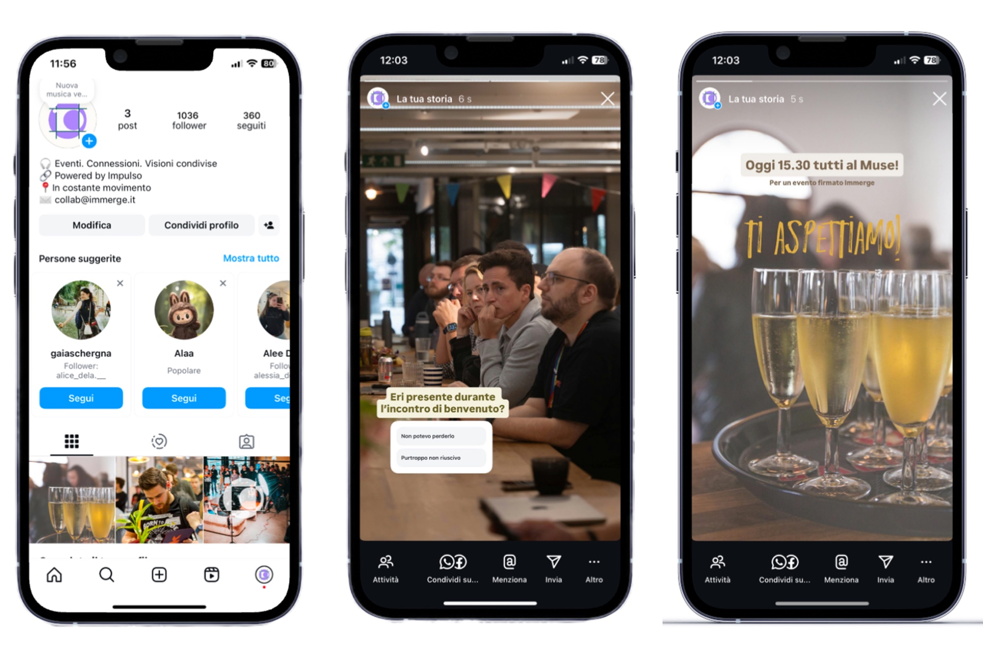
Instagram feed, posts and stories to tell the story of the events and what happens behind the scenes.
05 · The result
A modular identity, distinct from Impulso yet consistent with it, ready to grow with new events. The project became my diploma thesis in Graphic Design and Multichannel Communication.