The map The site
I compared the websites of leading hotels and apartments to understand how people book. That's where the map came from: pages, subcategories and the shortest path to booking.
Project · Interfaces
How do you bring a hotel's new style to its website too?
The hotel had just been renovated. The website had to become easier to use, especially for booking.
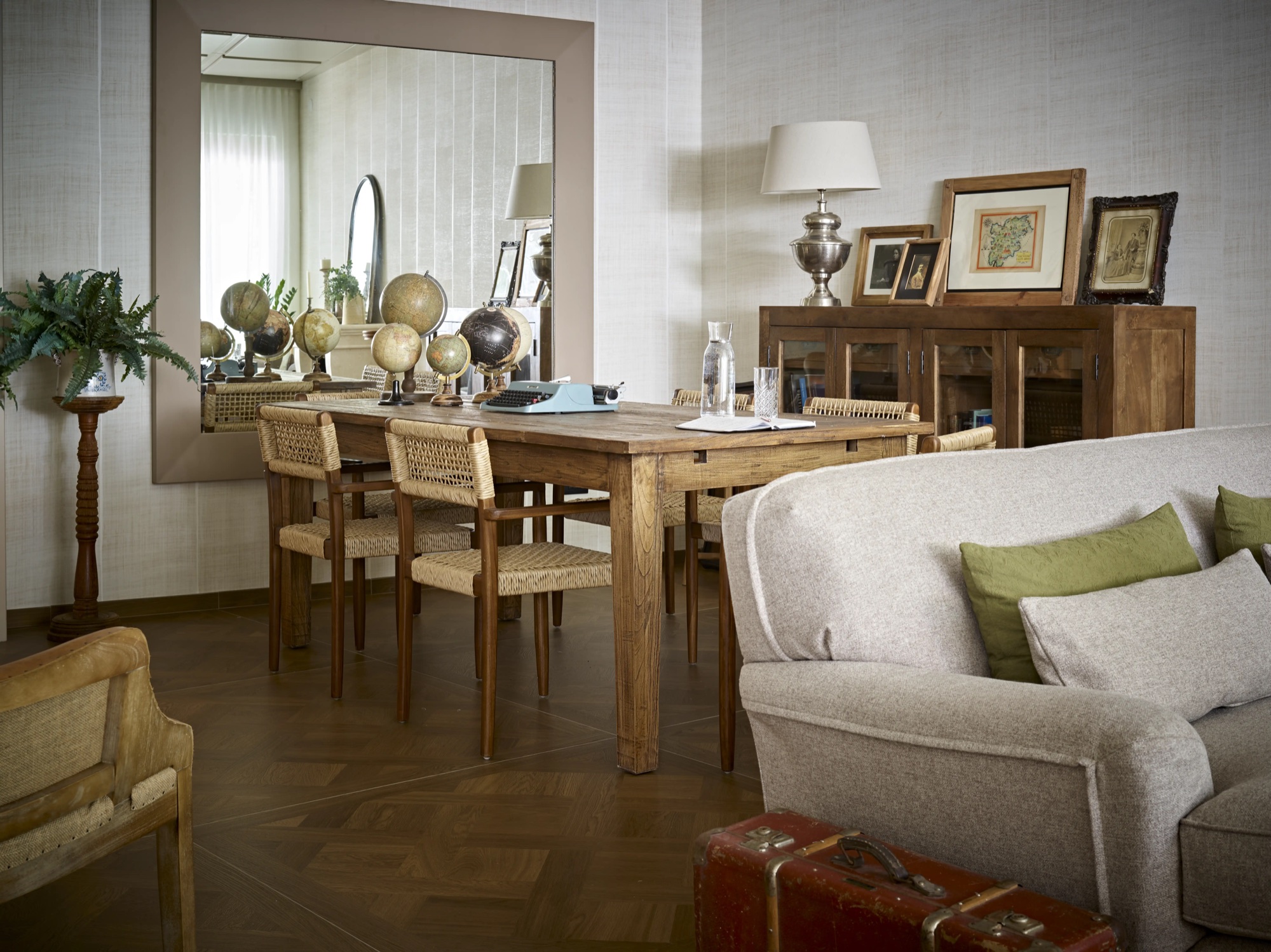
Bring the colors, wood and leaves of the lobby online: the same style, inside and out.
What I did
I compared the websites of leading hotels and apartments to understand how people book. That's where the map came from: pages, subcategories and the shortest path to booking.
Cool, natural tones, like in the hotel's restyling: the sage of the walls, the brass of the details and a warm white like paper.
Playfair Display for headings, elegant like the hotel. Inter for body text, clear and easy to read even on a phone.
Playfair Display
ABCDEFGHIJKLM abcdefghijklmInter
ABCDEFGHIJKLM abcdefghijklmThe lobby's decorative motif becomes a pattern for the website: the same style, inside and out.
Thin icons in the same green for the included services. The footer closes every page with the skyline of Trento and its mountains.
The Figma prototype
The whole website built in Figma, with the pages linked together. The homepage scrolls on its own: you can stop it with the pause button.
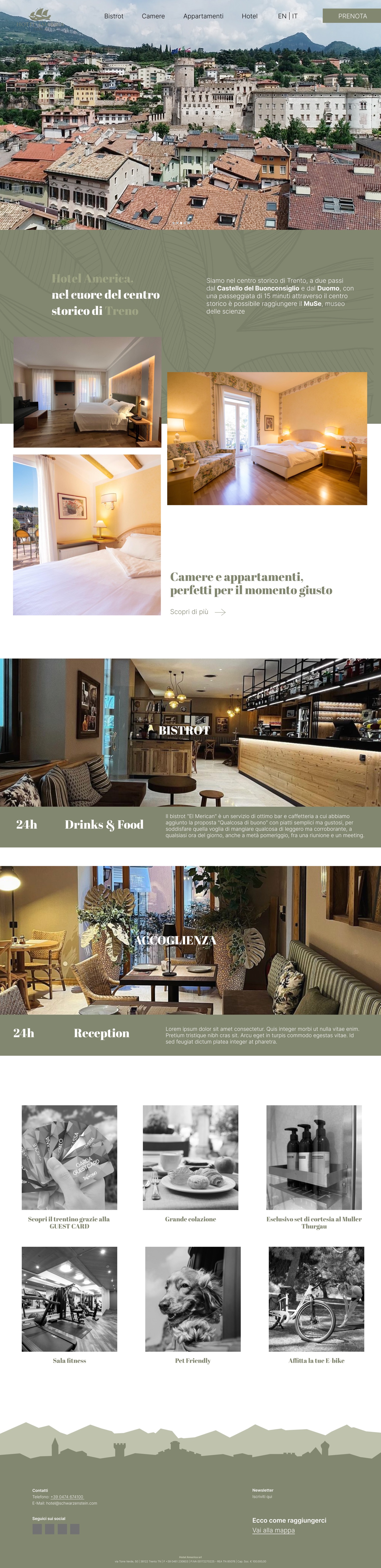
A complete prototype, consistent with the renovated hotel and ready for the developers.