A grid of lights
A 5×5 grid of dots, like server lights switching on and off. The circles grow and shrink: an animated logo that speaks of movement, energy and nonstop work.
Project · Logo & identity
How do you give a face to a robot that works where no one is looking?
A Milan startup with the first robot that services data centers remotely, and an identity still to be built.
Start from the place where the robot works: the data center, with its lights and its server rooms.
The first proposal
A 5×5 grid of dots, like server lights switching on and off. The circles grow and shrink: an animated logo that speaks of movement, energy and nonstop work.
By switching the dots on and off, the logo becomes a language: numbers, symbols and signals the robot can show the operator, even on its charging station.
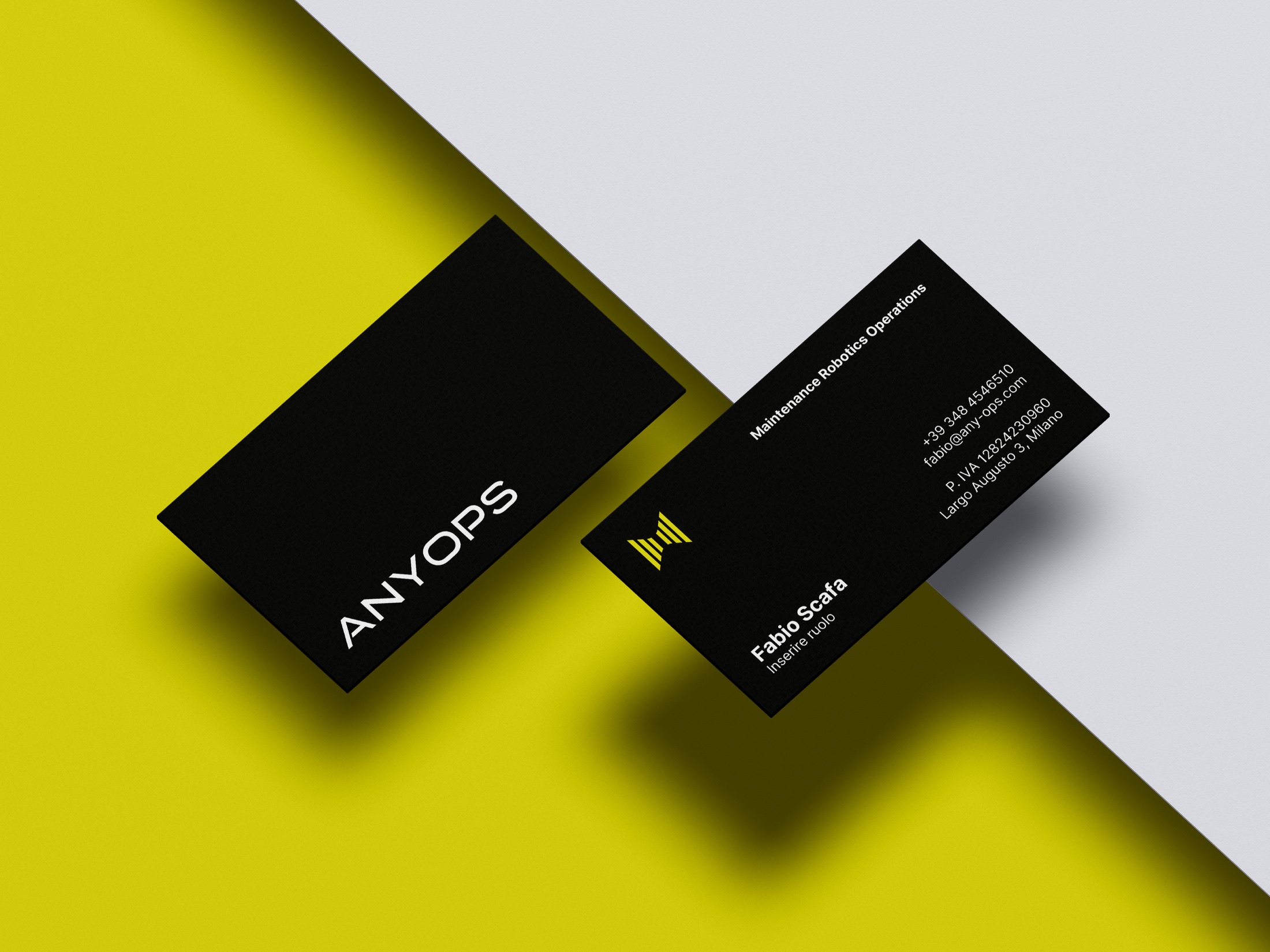
The logo works big and small: on the team's badges and on business cards.
The chosen proposal
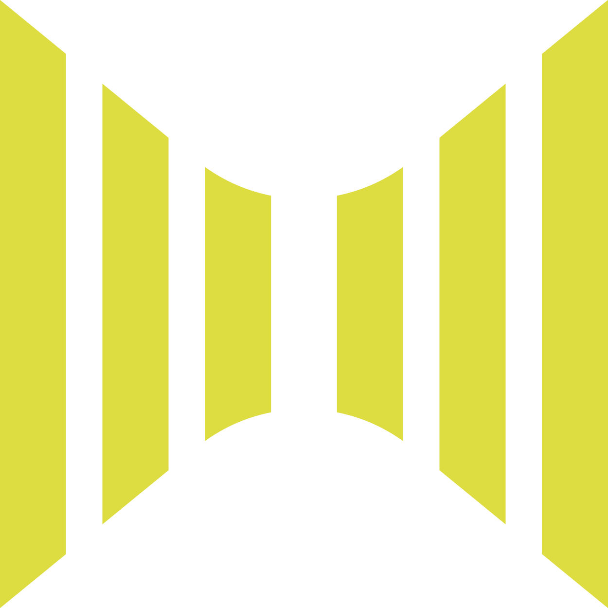
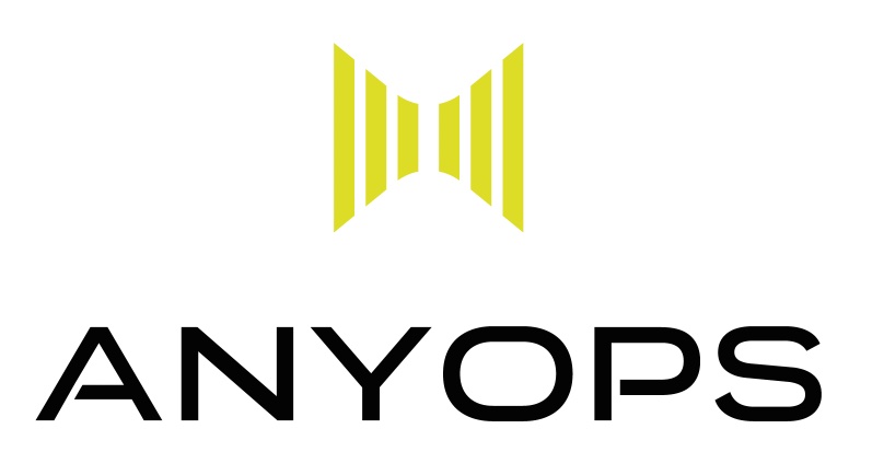
The bars are the rows of servers in a data center, seen in perspective. They speak of connection, reliability and security: the values of a company that does remote maintenance.
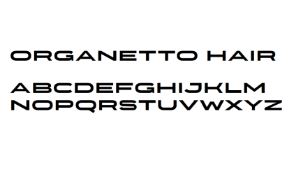
The typical colors of the tech world, with a green that adds energy. The logotype uses a wide, compressed typeface that looks to the future.
Business cards and badges for the team: the bright green stands out even from far away.
Two paths, one choice: an identity in bright green that feels like technology, energy and the future.